Publishing Design - Task 1 - Exercises
30.08.2022 - 17.10.2022 (Week 1 - Week 7)
Aishath Lene Abdulla Amir (0333185)
Bachelors of Design (Hons) in Creative Media / Taylor's University
Task 1 : Exercises
LECTURES
Lecture 1 - Format
The book is a medium for documenting and transmitting
ideas, knowledge, records, history, and other
information. It is the most traditional publishing
format. Magazines, newspapers, and even online articles
can now be considered forms of publishing. This
lecture describes the history of books in various
cultures such as the Middle East, South Asia, Africa,
and Europe. Furthermore, it explains the various formats
used to create books in these cultures, such as palm
leaf manuscripts, Chinese bamboo strips, and European
parchment.
Lecture 2 - History of Prints
2nd and 8th century AD
During the AD 175, the Chinese Emperor orders
that the six main classics of Confucianism be
carved in stone. Confucian academics eager to
obtain these significant texts simply laid sheets
of paper on the engraved slabs and rubbed them
with charcoal or graphite, leaving a text in white
characters on a black backdrop.
AD 750 - 768
A sutra that was printed in Korea in AD 750 is the
oldest known printed document in history. This is
followed in Japan, where the empress ordered a
massive edition of a prayer or lucky charm from
Buddhist Nara in AD 768. The box was kept in a
bamboo box.
AD 868
The Tang dynasty created the first book known to
have been printed. It is a 16-foot-long scroll that
is one feet in height. Paper sheets are attached at
the edges to form it. The scroll's first sheet
contains the world's first printed illustration,
showing an enthroned Buddha surrounded by holy
attendants. The text is the Diamond Sutra.
10th - 11th century
All the Confucian classics are published for the
use of scholar officials, together with huge number
of Buddhist and Daoist works and the complete
Standard Histories in the time of Sima Qian. The
carving of so many characters in reverse on wood
blocks until the introduction of moveable
type.
From the 11th century
Moveable letters that can be arranged in any
correct order. t was experimented in China, but the Chinese script
has too many characters which made type-casting and
type-setting become too complex, and the characters
were made in clay which made it really fragile.
14th century
Moveable type in bronze which is strong for repeated
printing, dismantling and resetting for new text.
Koreans invent their own alphabet.
AD c. 1400
Printing from wood blocks introduced by Europe. In the
east. images are printed by laying a piece on paper on
carved and inked block and rubbing its back to
transfer the ink.
1439 - 457
Gutenberg was actually the first one in Europe who
created printing press, but his idea was taken and
made famous by others. Gutenberg was only known after
someone did research on this topic.
Lecture 3 - Typo Redux
In addition to being a form of expression and
communication, typography is the art of
organising and composing text. This lecture
describes the characteristics of typography. The
topic of legibility and type design, as well as
unique formatting techniques, are covered in
detail.
Lecture 4 - The Grid
The grid suggests orderliness in design and
conveys a sense of compact planning,
comprehensibility, and clarity. It contributes
to a seamless user experience. A 2D plane or a
3D space is divided into smaller compartments by
the grid. The "gutter" is the area between the
columns.
Lecture 5 - Elements
A book is made up of three basic components: type,
colour, and image. In the lecture, it is discussed
how to consistently use variations as well as the
significance of Form and Movement in the design of
books and layouts. Being unpredictable is
crucial. While maintaining consistency throughout
the book, designers must work to adjust the
layout. The use of text, colour, and graphic
elements can all be varied. Every page turn should
bring a new surprise due to the layout order.This
doesn't mean that every spread has to be different
as it is expected that we re-use and rotate the
formulas in the books. The grid is used in a
modular fashion where the elements are positioned
logically but also in a compositionally attractive
manner.
INSTRUCTIONS
Figure 1.0 - MIB - 30/08/2022
Task 1: Exercises
Week 1
Exercise 1 - Text Formatting
Figure 1.1 - Text Formatting - 30/08/2022
Exercise 2 - Mock-up Making
In this exercise, we were required to prepare:
A3 Paper
Large rubber band/thread with needle
Steel Ruler (16" if you have)
Cutter
Pencil
For the first exercise the we had to pick a size for our book.
The sizes that I have explored are:
170mm x 260mm
190mm x 240mm
222mm x 220mm
Figure 1.2 - Book size exploration - 30/08/2022
The final size that I chose was 190mm x 240mm
Figure 1.3 - Final cut - 30/08/2022
Figure 1.4 - Final cut - 30/08/2022
Figure 1.5 - Book front - 30/08/2022
Figure 1.6 - Book back - 30/08/2022
Figure 1.7 - Final book mock-up - 30/08/2022
Week 2
Exercise 3 - Signature folding systems (8+8=16)
The signature folding system folded piece of paper that in the end
creates 16 pages.
Figure 1.8 - Signature folding system Layout - 30/08/2022
Figure 1.9 - Signature folding system Layout - 30/08/2022
Figure 1.10 - Signature folding system Book - 30/08/2022
Figure 1.11 - Signature folding system Book - 30/08/2022
Week 3
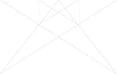
Exercise 4 - Classical Grid Structure
Van De Graff
Figure 1.12 - Van De Graff - 30/08/2022
Figure 1.16 - Van De Graff (Indesign) - 30/08/2022
Figure 1.17 - Van De Graff (Indesign) - 30/08/2022
Week 4
Exercise 5 - Determining Grids
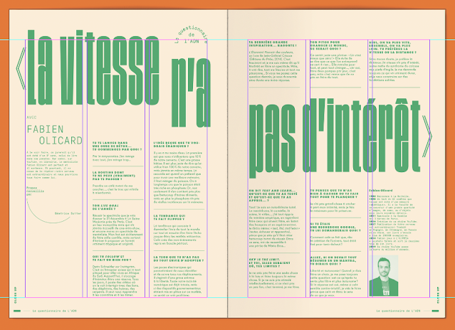
In this exercise , we are required to choose a spread layout and
try to determine the grid system that were used.
Figure 1.18 - Determining Grids (Indesign) - 30/08/2022
Figure 1.19 - Determining Grids (Indesign) - 30/08/2022
Grid systems exercise -
After this we had to determine 3 different kinds of grid
system layout for our book.
Figure 1.20 - Grids System Layout 1 (Indesign) - 30/08/2022
Figure 1.21 - Grids System Layout 2 (Indesign) - 30/08/2022
Figure 1.22 - Grids System Layout 3 (Indesign) - 30/08/2022
After some thought I went with layout 3 (Fig. 1.22) for my book.
Week 5
Exercise 6 - Form and Movement Exercises
- 1 Colour
Figure 1.23 - Form and Movement 1 colour (Indesign) - 30/08/2022
- 2 Colours
Figure 1.24 - Form and Movement 2 colour (Indesign) - 30/08/2022
- Colours + Image
Figure 1.25 - Form and Movement Colour + Image (Indesign) - 11/08/2022
- Image +Text
Figure 1.26 - Form and Movement Image +Text (Indesign) - 11/08/2022
FEEDBACK
Week 1
General Feedback: -
Specific Feedback: -
Week 2
General Feedback: You have to create 16
visuals for your story, make sure that the
visuals created aren’t literally what the
words describe.
Specific feedback: The introduction for the
story line is too short, make sure that the
introduction is close to equivalent to the
chapters.
Week 3
General Feedback: - formatting text should appear in
task 1 and task 2
- grid and text on in design (50 character and no
less than 35 characters in one line)
- Come up with 3 different grid systems (3 layouts
for the book)
Specific Feedback: - In the type of illustration of
choosing, the details are very important. You can do
the kine sketches of all the illustrations first and
then do the colouring after.
Week 4
General Feedback: -
Specific Feedback: - -The
submission of the e
portfolio for task 2 is due
week 6.
Week 5
General Feedback:
- The formatting
should be done by
next week. The
next time, you
should attempt
something that is
different but
works well with
the story and your
illustrations.
Specific Feedback:
- The text font is
a bit too harsh,
you should feel
more comfortable
to crop and scale
the images in a
way that will fit
the layout. The
illustrations are
a bit blurry, you
can try to fix it
by increasing the
noise of the
illustrations and
try to maintain
that throughout
all the other
illustrations as
well.
Week 6
(mc)
Week
7
General
Feedback:
- Submissions for task 1 and 2 will be due on the 18th of October, Make sure that all the exercises are posted accordingly.
Make sure when you print the book it is able to fit into the a3 paper in a way that is easy to cut, to do that you can turn on the bleed settings.
Make sure when you print the book it is able to fit into the a3 paper in a way that is easy to cut, to do that you can turn on the bleed settings.
Specific
Feedback:
- Print the thumbnails of the book layout to see if the flow of your layout works well. For the coming week, finish the whole layout after making the final adjustments and print the book in black and white before you print them in colour.
REFLECTION
Experience
The overall experience is that I learned a lot from this task. By applying so much practical work into these exercises made it all the more fun and easy to understand in my experience. For the first few exercises I didn't quite understand why it was being done this way, but the more we went on I understood that these practices helped us create better layouts in our design.
Observation
I wouldn't say that this task was very difficult for me, although challenging because it took me a while to get used to how to organise the layouts of my grids better. I think the only challenge for me was that I had a hard time being punctual with my time management. But in the end I think it didn't turn out too bad as I was able to finish this task on time.
Findings
I found the most fun to do the form and movement exercise. I think this is because I liked how the flow of the exercise went, starting from the most basic 1 colour to adding elements to each step of the exercise. I was almost satisfying to see how the last part of the exercise turn out. Overall I found this task to be quite an experience, as there are so many layers to it.
OTHER RESOURCES
Figure 1.27 - Other Resources - 16/10/2022
link --> https://design.tutsplus.com/articles/everything-you-need-to-know-about-book-design--cms-41844


Comments
Post a Comment