Publishing Design - Task 3B - E-book
26.10.2022 - 22.11.2022 (Week 9 - Week 13)
Aishath Lene Abdulla Amir (0333185)
Bachelors of Design (Hons) in Creative Media / Taylor's University
Task 3B : E-book
INSTRUCTIONS
Figure 1.0 - MIB - 30/10/2022
Task 3B: E-book
Week 10
For the first week of this task we had to determine the grid system
we would be using for the e-book. As well design the a layout for the brand guidelines.
First attempt
Figure 1.1 - Layout 1 - 21/11/2022
Figure 1.2 - Layout 1 - 21/11/2022
Layout 2
Figure 1.3 - Layout 2 - 21/11/2022
Figure 1.4 - Layout 2 - 21/11/2022
Mr Vinod noted that both of the layouts I had created does not show much of a difference, essentially pointing out that, there is not much feedback that he can give in terms of bringing any kind of improvement to these layouts.
3rd attempt
Figure 1.5 - Layout 3 - 21/11/2022
Figure 1.6 - Layout 3 - 21/11/2022
Figure 1.7 - Layout 3 - 21/11/2022
After the 3rd attempt, there was still a lack of creativity and excitement in the navigation.
Week 11
For week 11 we had to make sure that our layout and the navigation are finalised. I had a little bit of trouble at first
Figure 1.8 - Navigation - 21/11/2022
I utilised the lines I had used in the 3rd attempt to create the final layout
Figure 1.9 - Grid - 21/11/2022
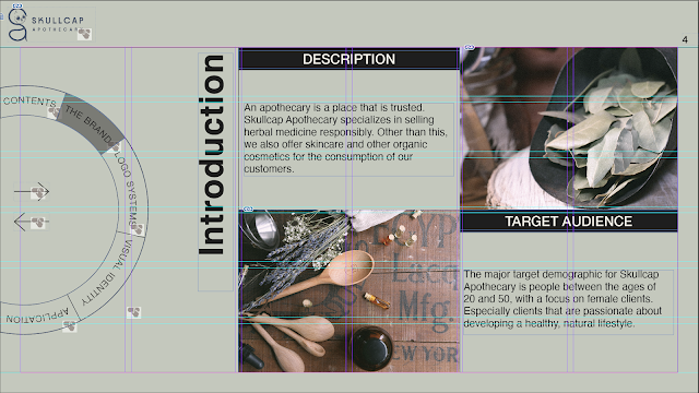
Figure 1.10 - Layout - 21/11/2022
Week 12
For week 12 we had to finish the whole ebook, so that we can bring any changes to it after the feedback.
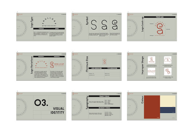
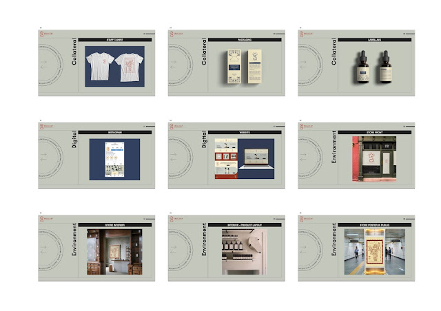
Figure 1.11 - Progress - 21/11/2022
Figure 1.12 - Progress - 21/11/2022
Figure 1.13 - Progress - 21/11/2022
Figure 1.14 - Progress - 21/11/2022
There were still a few things Mr Vinod was unhappy with, such the choice of colour palette. He said there is much room for improvement there.
I struggled a little bit with the buttons because they weren't visible when highlighted. I only realised the problem later on and was able to fix this problem in time.
This is how the button will look when it is highlighted (fig. 1.14)
Figure 1.14 - Navigation - 21/11/2022
And this is how the button looks after you click it and it directs you to the linked destination (fig. 1.15)
Figure 1.15 - Navigation - 21/11/2022
I feel like some of these final changes were absolutely necessary, such as changing the colour palette a bit. I removed the dark red-brown colour and implemented an almost whit-ish grey to the palette.
FINAL OUTCOME
Thumbnail
Figure 1.16 - Thumbnail (PDF) - 21/11/2022
Figure 1.21- Final Outcome - Interactive PDF - 21/11/2022
Flip HTML
Figure 1.22 - Flip HTML - 10/11/2022
FEEDBACK
Week 10
General Feedback: - Brand identities typeface
should be a Web safe
typefaces
Should have the same line
length. Introduce a mock up
of the logo as well, not just the
graphical logo.so that we can get
a better sense of texture of the
logo. Test different navigational
systems and complete the 1st page
until first chapter
Specific Feedback: - The two
layouts you created look the same.
if you do that it looks too
generic like a website Navigation
should not interfere with the
layout. However it can still look
different without compromising the
content. Think beyond placing the
navigation on either the top to
the side
Week 11
General Feedback:
- do the navigational
bar in a separate
document to make sure
that it works properly
(figure out how to
make the navigational
bar highlighted.
First create the
rollover then export and
check if it works well.
Then introduce the link
to the page, export and
check if it works. Do
not activate the links
at first. That should be
the last step of the
process
Specific Feedback:
- Good design
layout. Make sure
that the images used
have a same feel to (
add similar overlay)
make the pictures look
similar like they come
from the same place. For
the text formatting you
should follow as how you
do the contents, less
pace on the sides and
you can decide if to add
space on the top and the
bottom
Week 12
General Feedback -
For next week make
sure that the
exported
interactive PDF
works properly. It
is a must for the
document to work
on Google Chrome.
Specific Feedback
- The colour
palette used for
the brand isn't
good. There are a
few things I would
also change about
the logo because
the letter "a"
looks weird.
REFLECTION
Experience
The overall experience for me was that it went pretty well. at first I had a bit of trouble with creating a proper layout. especially when it came to the navigation. I had a hard time coming up with something that was creative enough to make the overall experience of the brand guidelines exciting.
Observation
I had to make sure that the navigation I had created is able to communicate well with the user. That hey understand the navigation. I also observed that when we are asked to make a navigation bar, the designs are usually very bland and it is something that you will always see often.
Findings
I found that in this module the user experience in this case for the brand guidelines are very important, it is also the main part in which most of our marks will be taken on. I think that the overall outcome is something that I am happy with. I was able to come out of my comfort zone, because I think i was being very safe with my first few attempts at creating the layout.
FURTHER READING
Figure 1.22 - Further Reading - 10/11/2022
This article gives us a deeper understanding of what brand guidelines are. The main points highlighted in this article include what are brand guidelines, what should be included in brand guidelines, why are they important and how to create brand guidelines. The principles and criteria used by a business to achieve brand consistency across all platforms are known as brand guidelines. By establishing the framework for visual, vocal, or written communication, they provide the foundation for a great brand to develop and prosper.


Comments
Post a Comment